
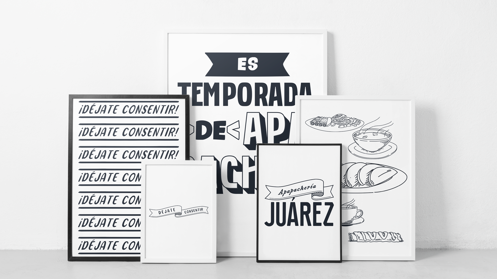
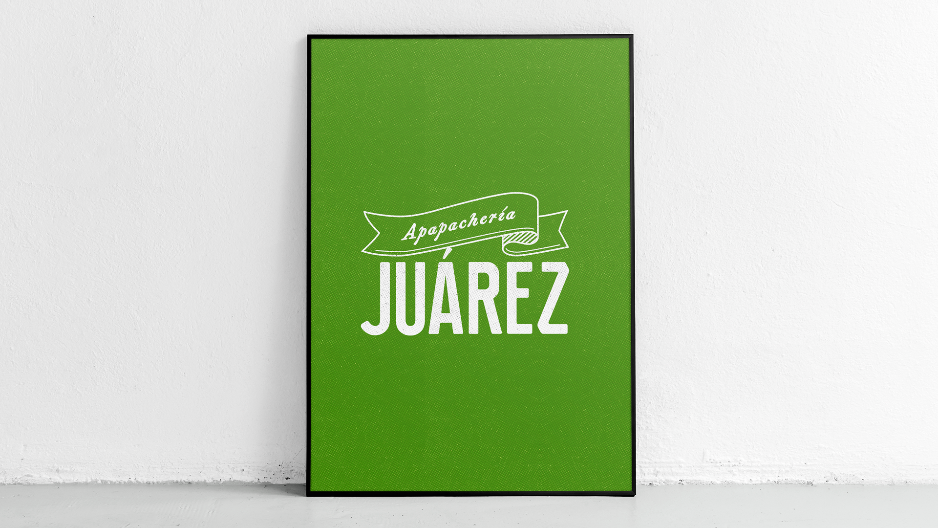
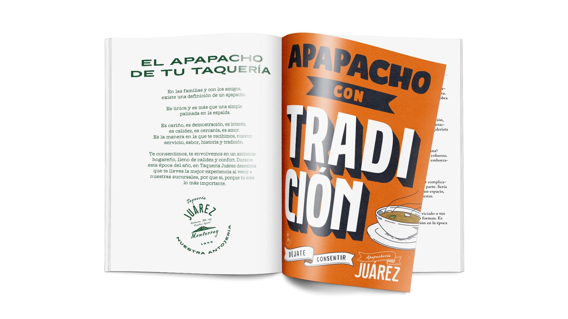
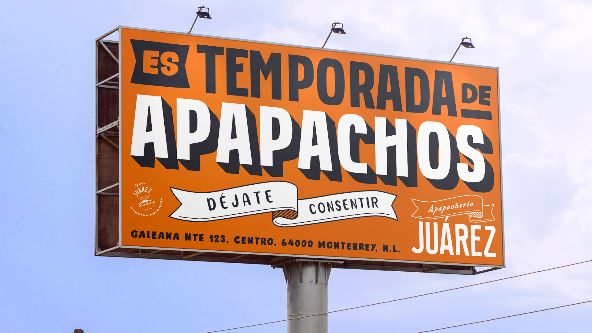
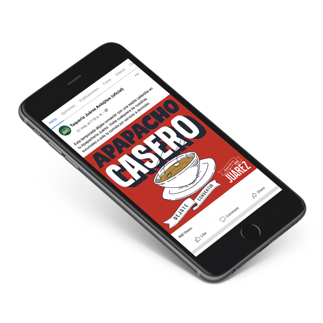
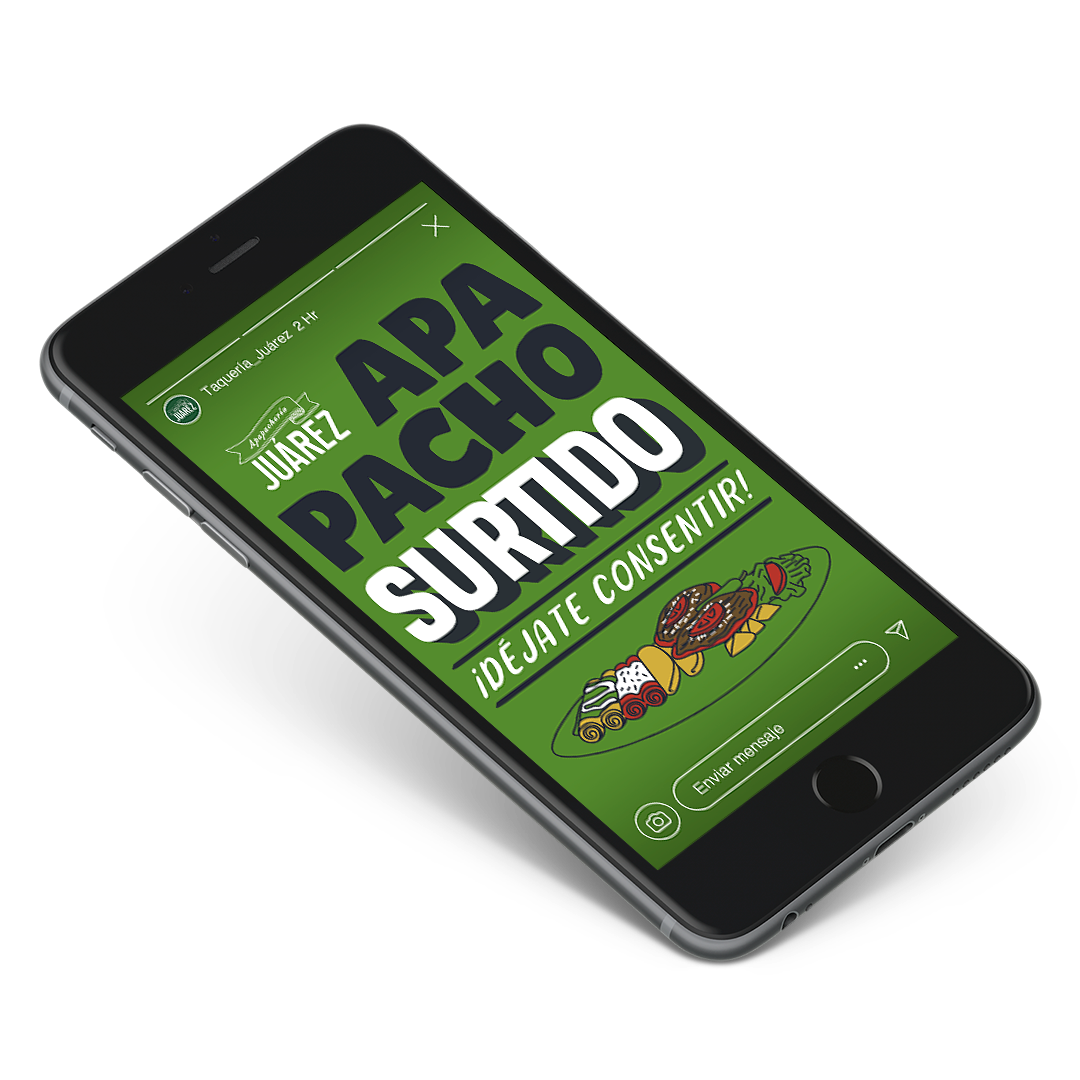
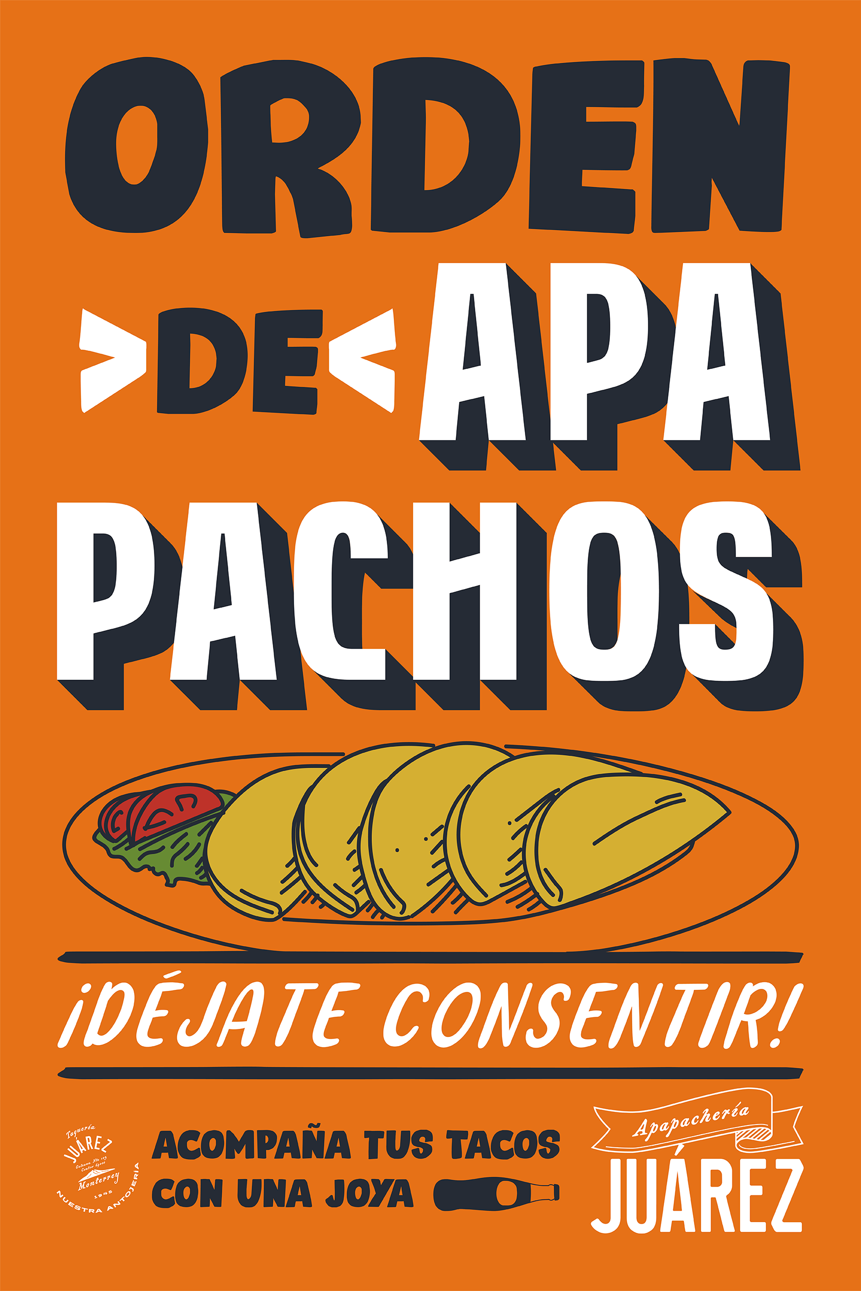
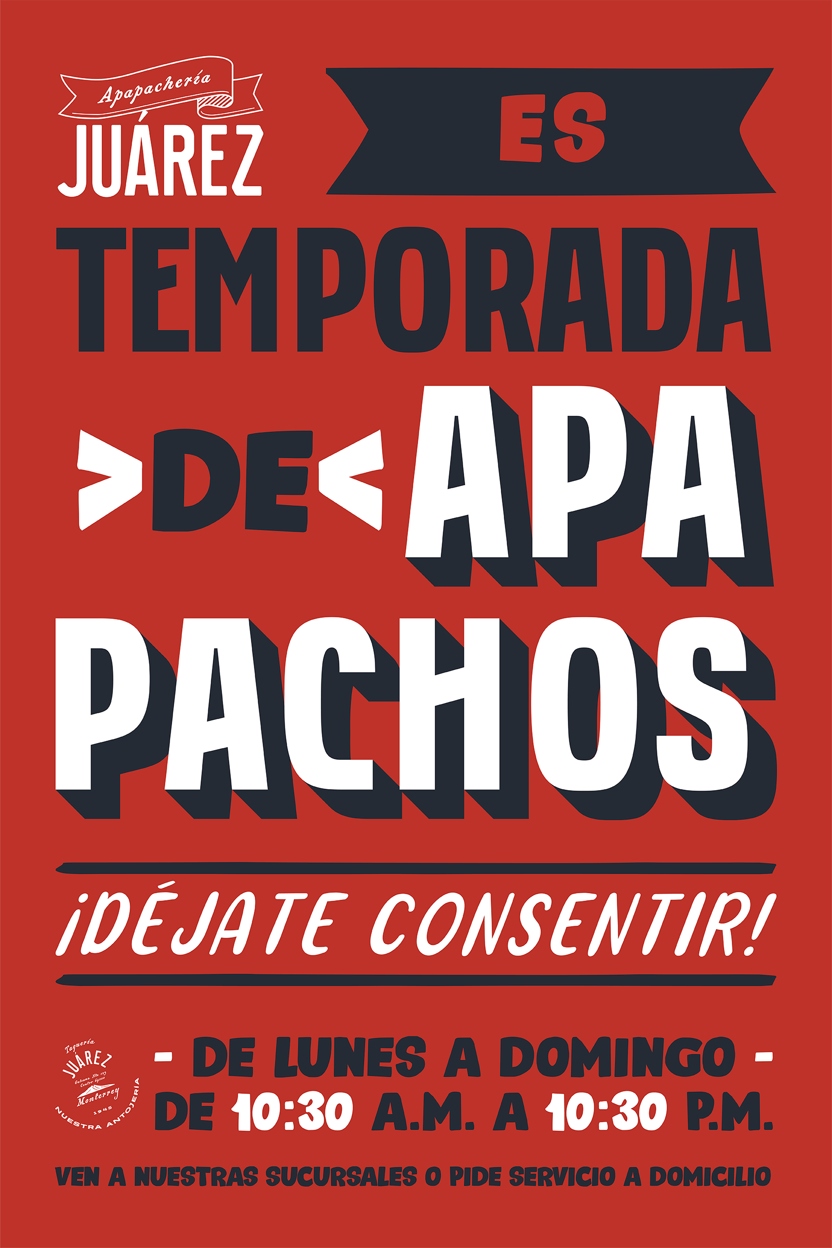
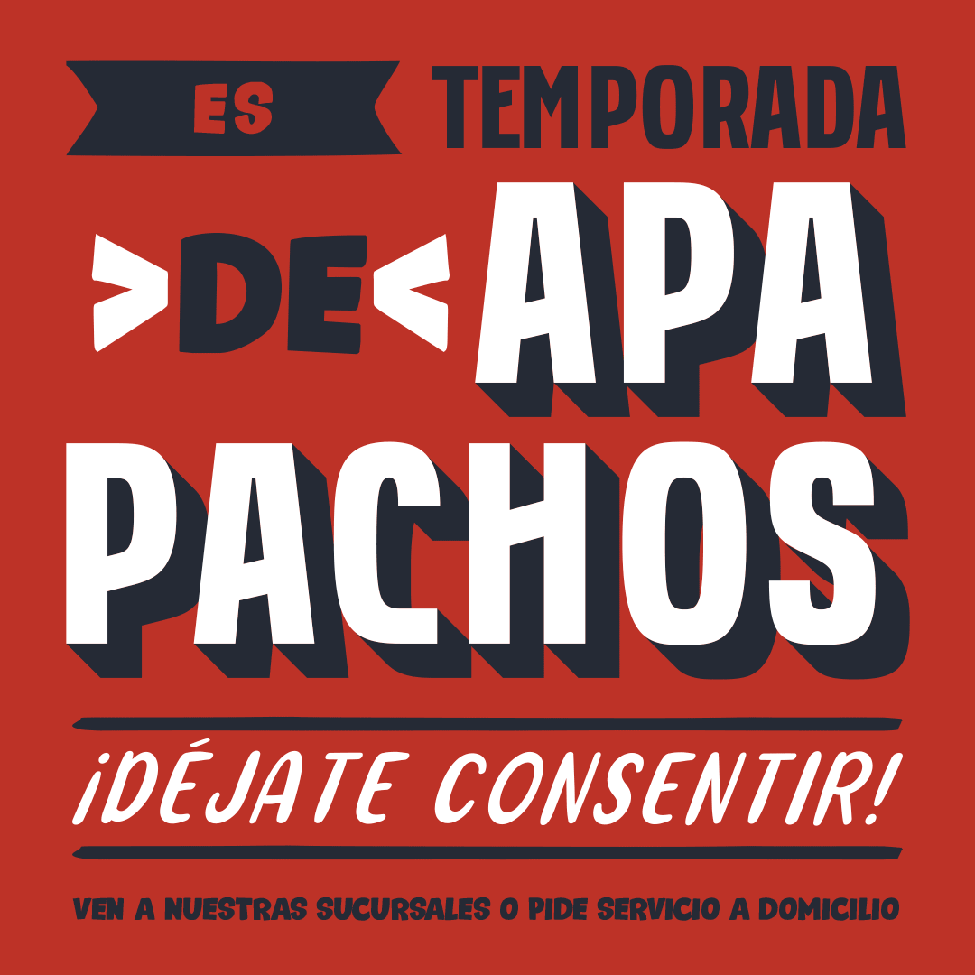
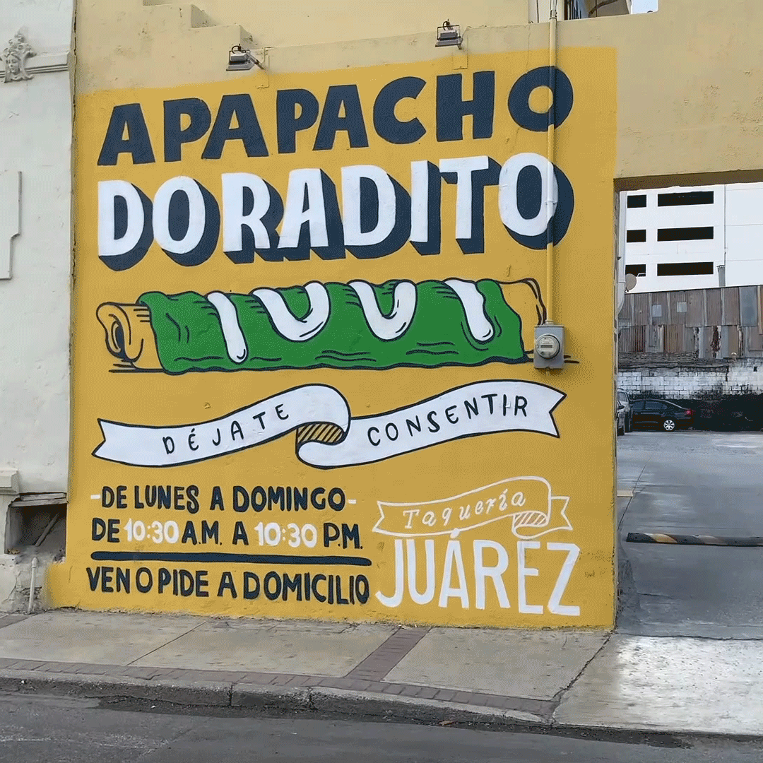
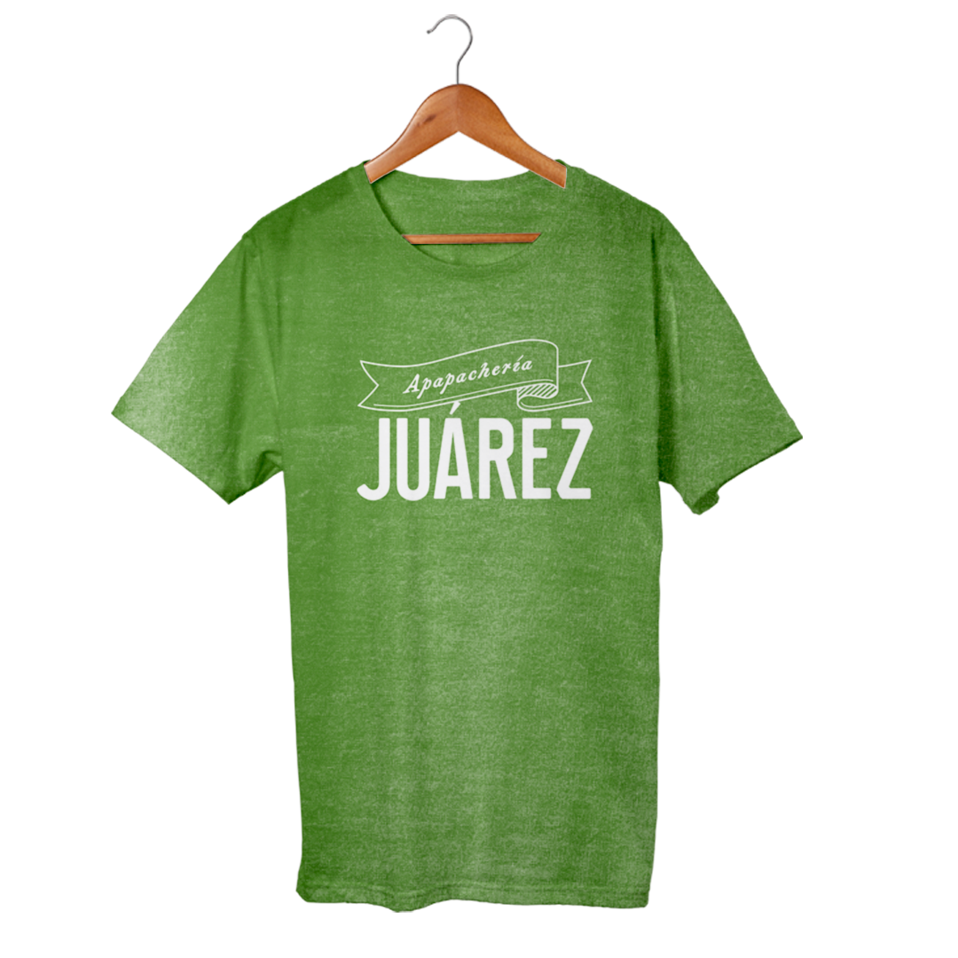
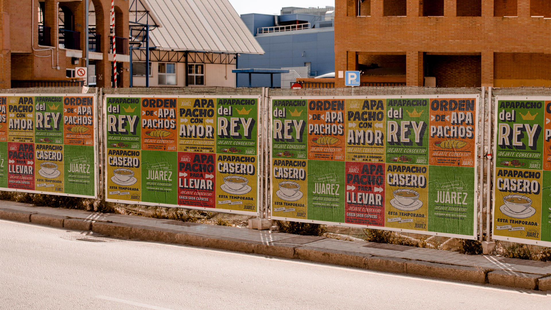
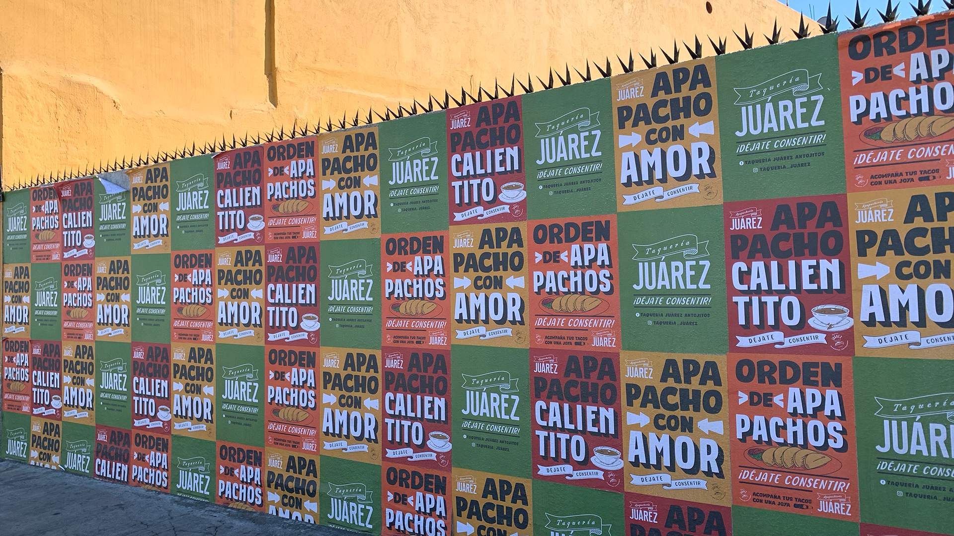
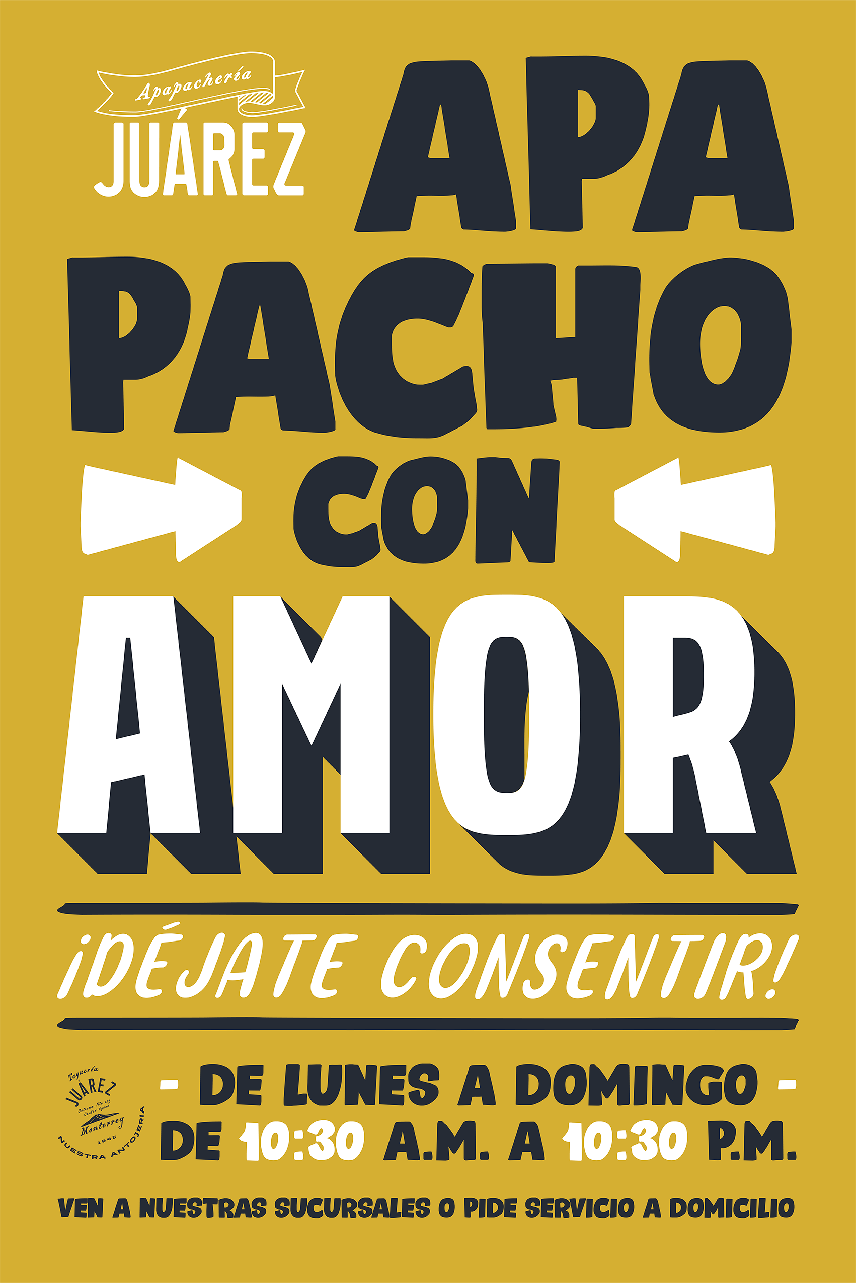
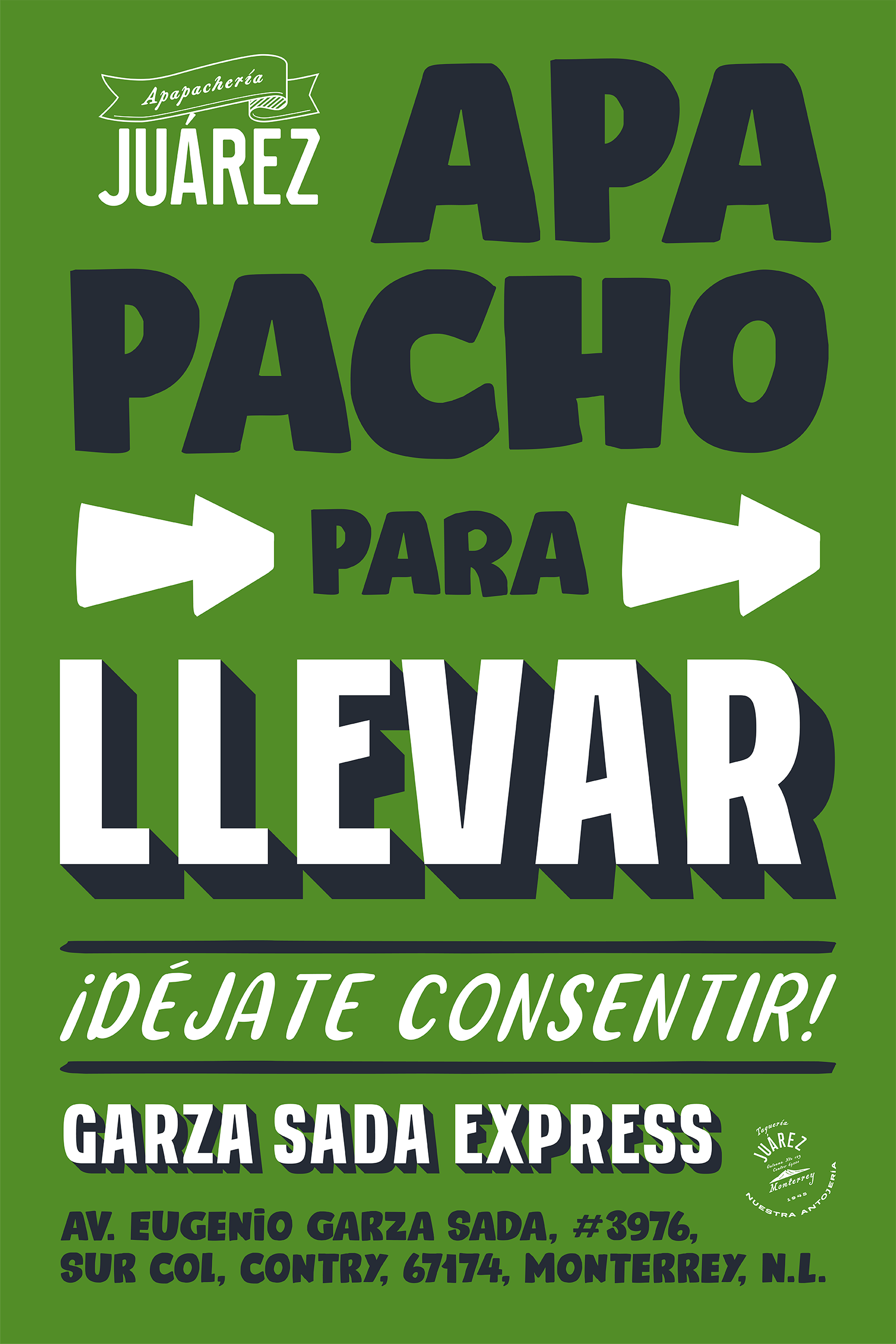
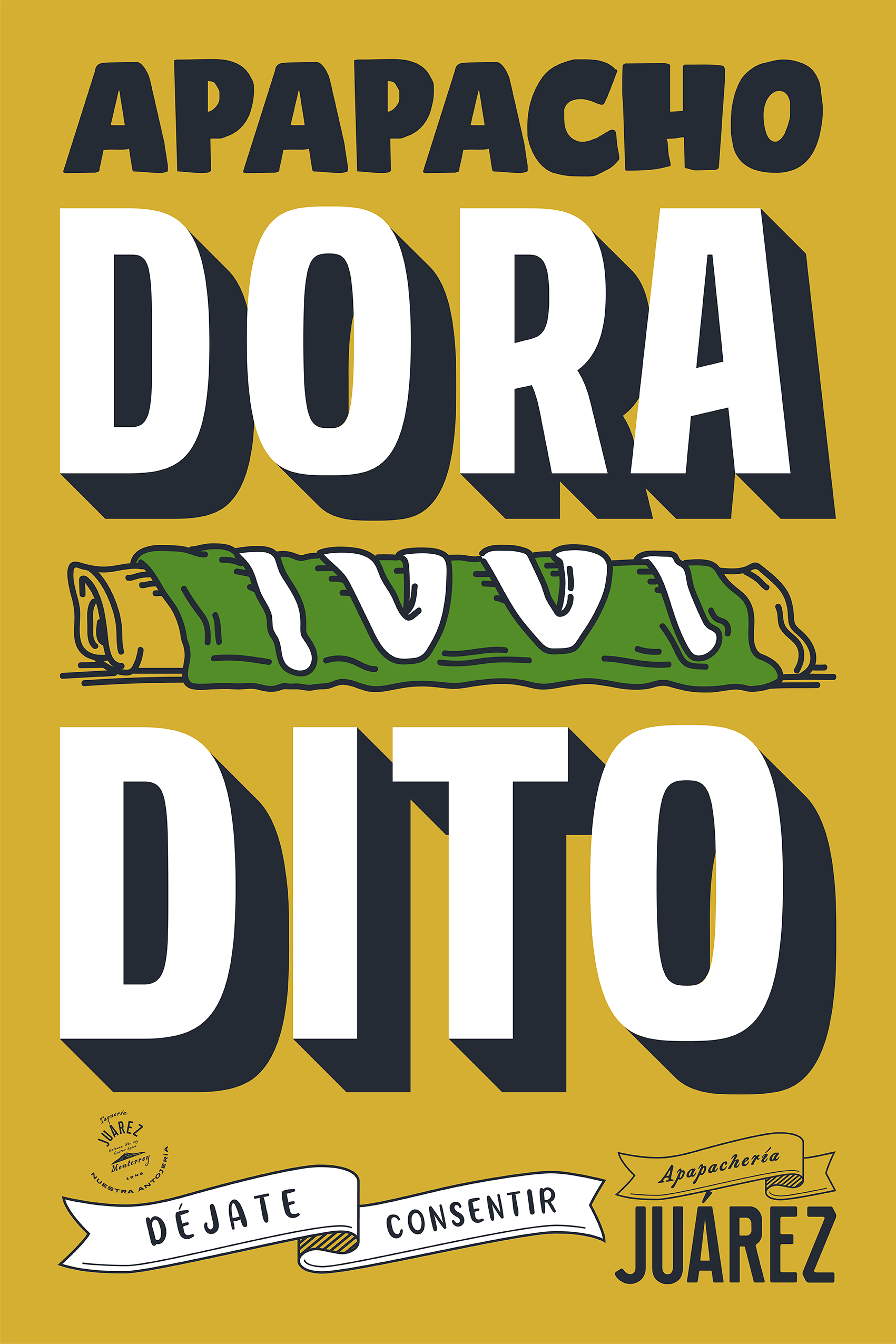
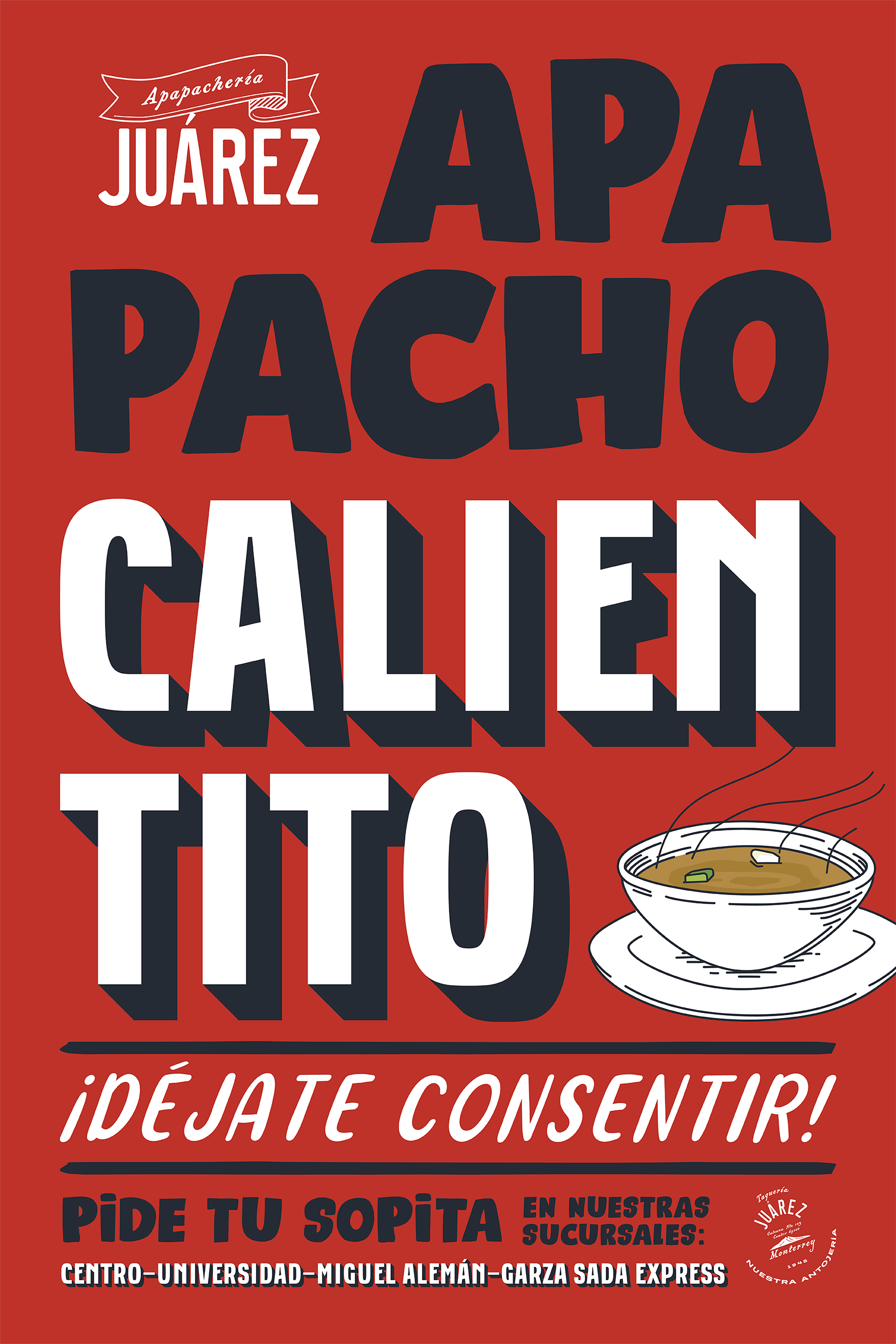
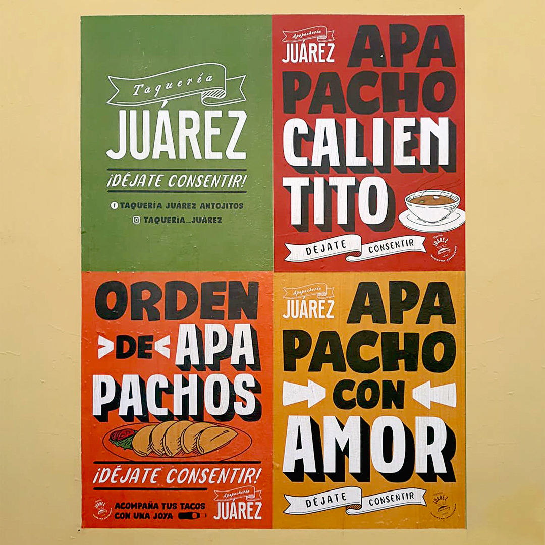
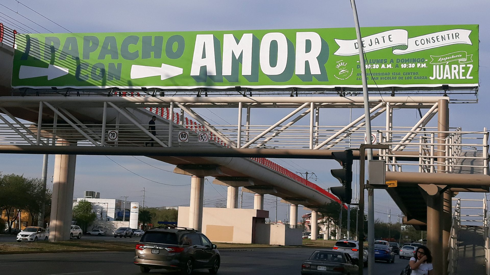
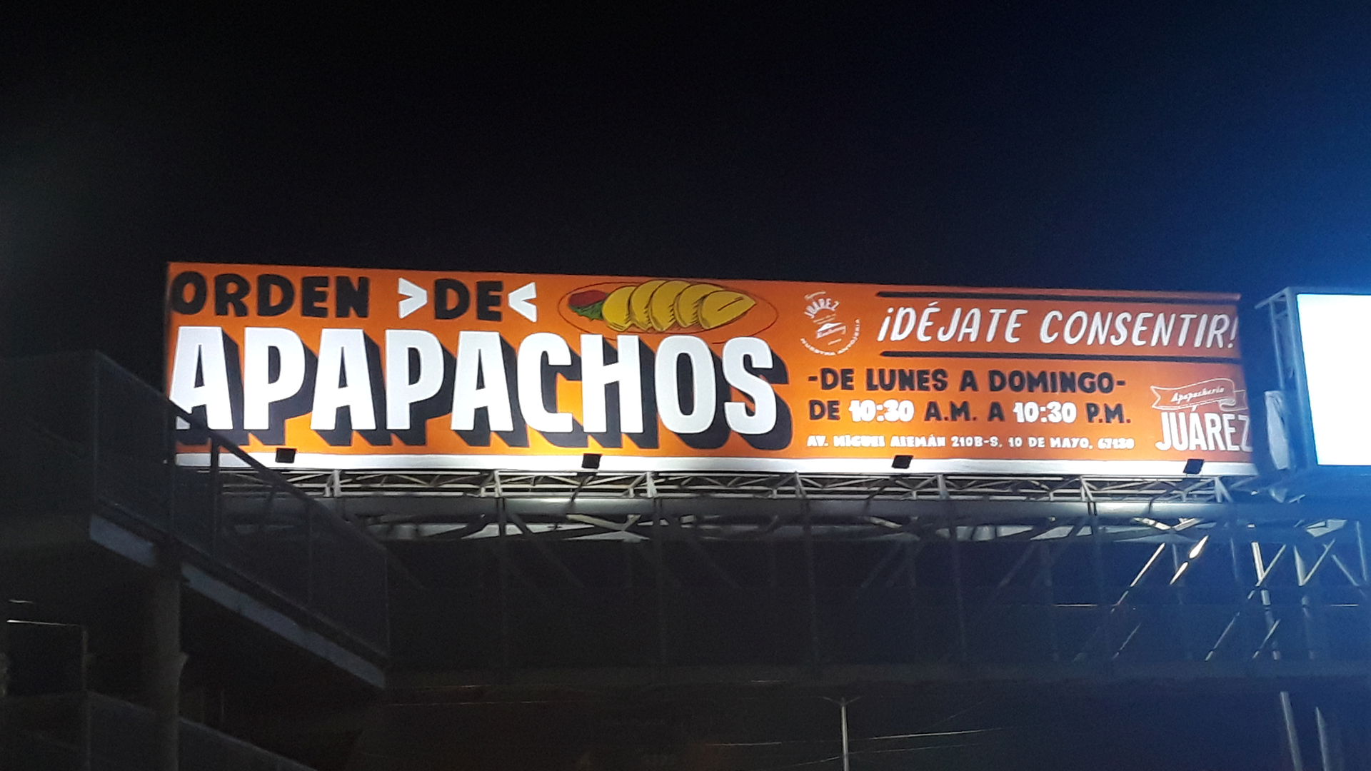
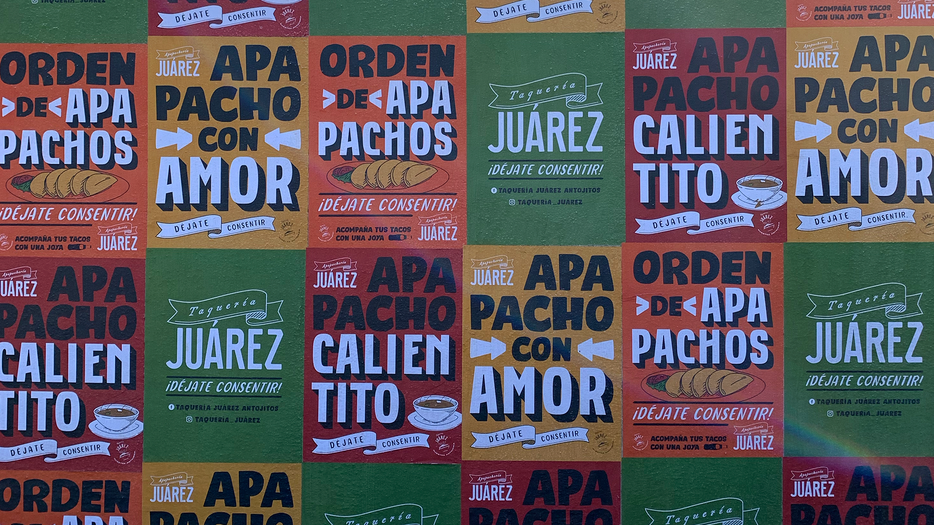
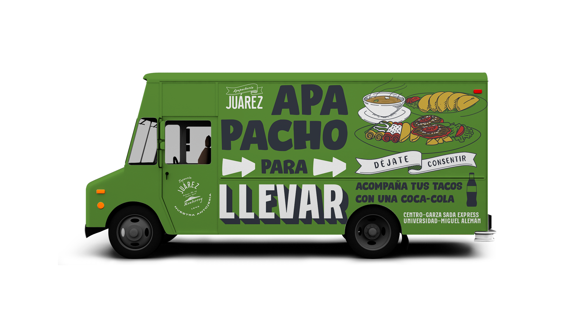
From being your “Taquería” to being your “Apapachería”. That’s our way to name the love and caring offered in this regional iconic restaurant.
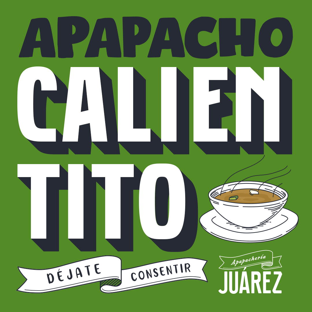
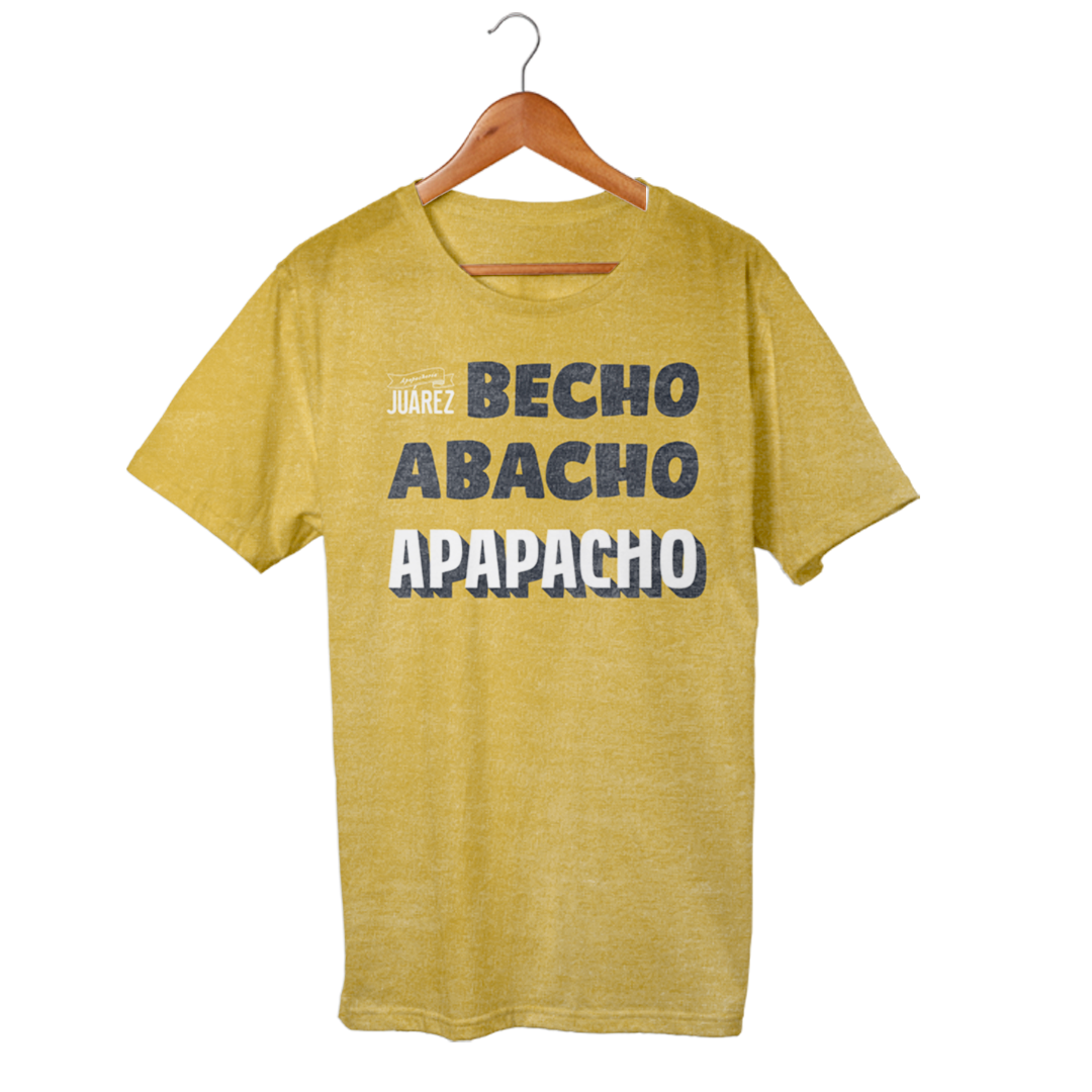
For this past winter season we changed the brand’s descriptive to demonstrate our customers our “Apapacho”(as for affection, cuddle).
A compromise of warmth and service on everything that the Taquería Juárez does for its clients. A promise delivered in every single meal and every table.
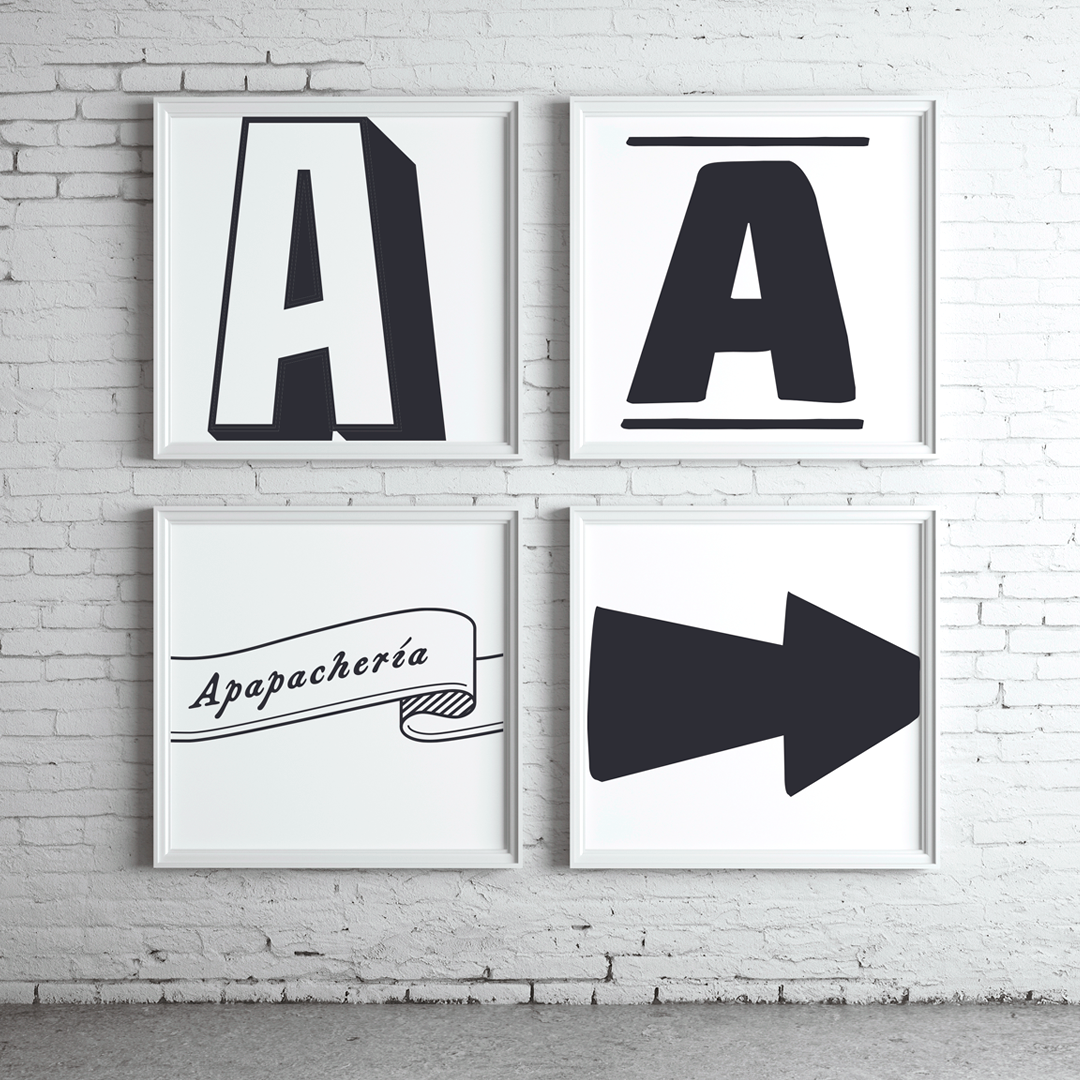
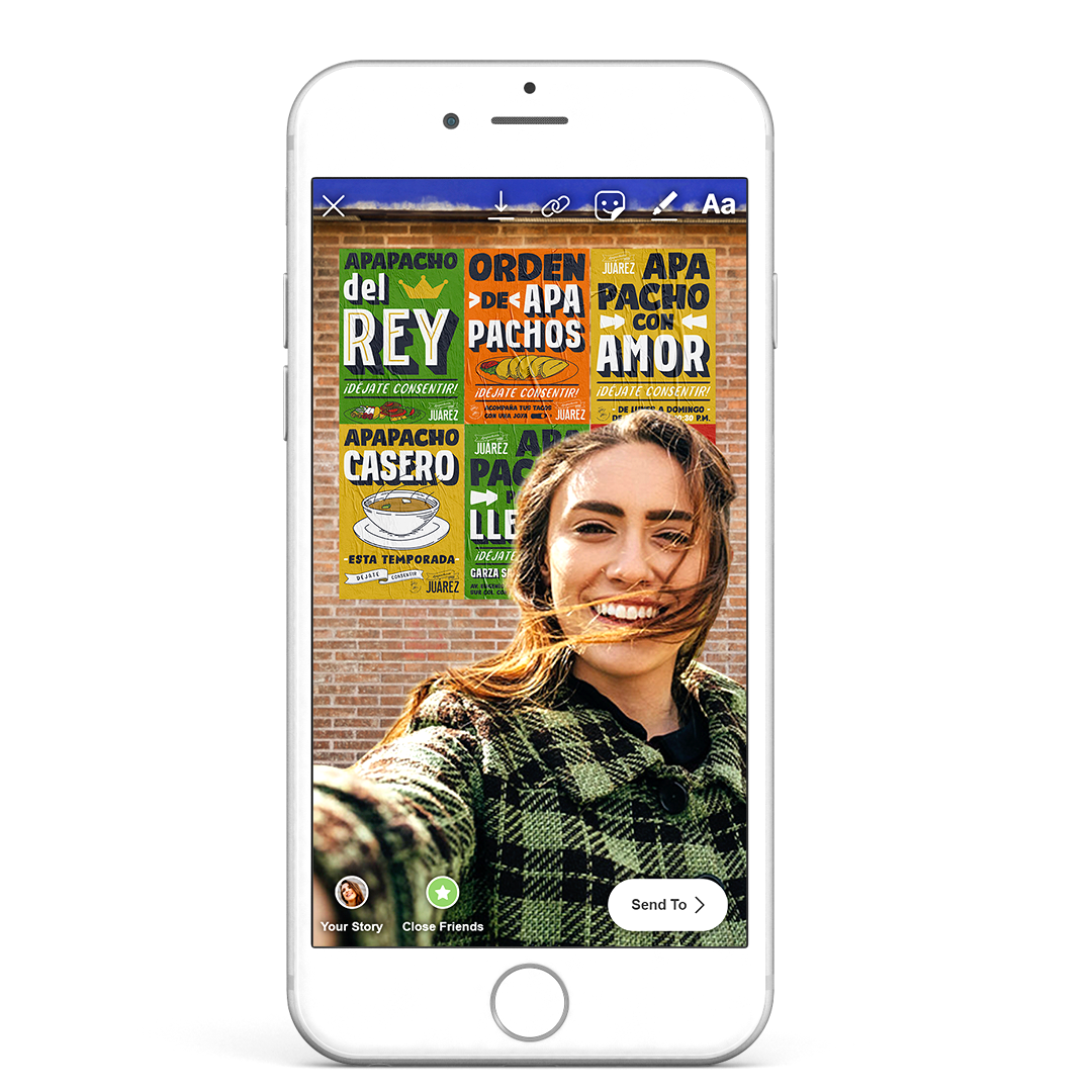
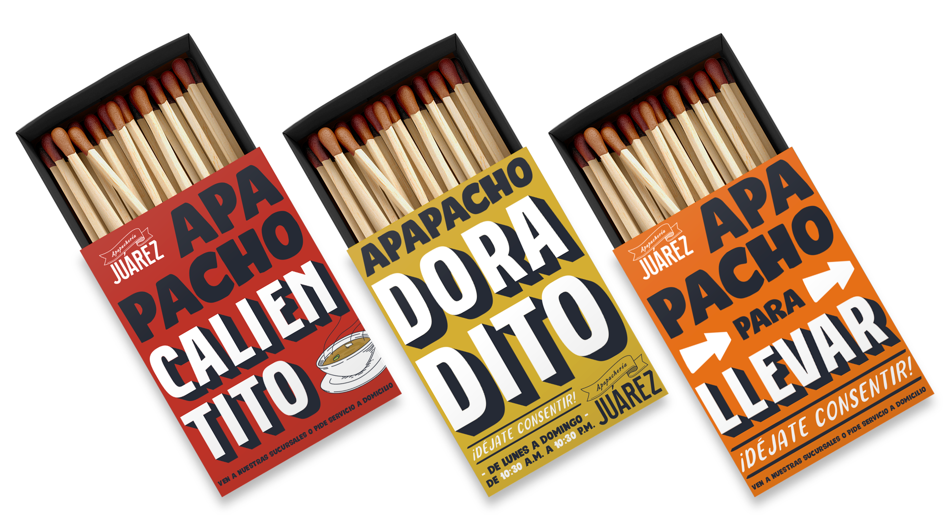
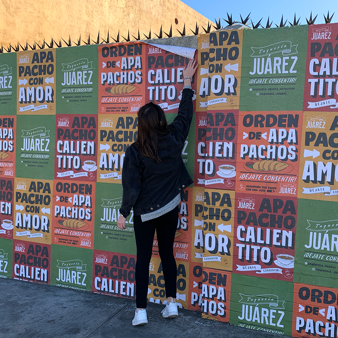
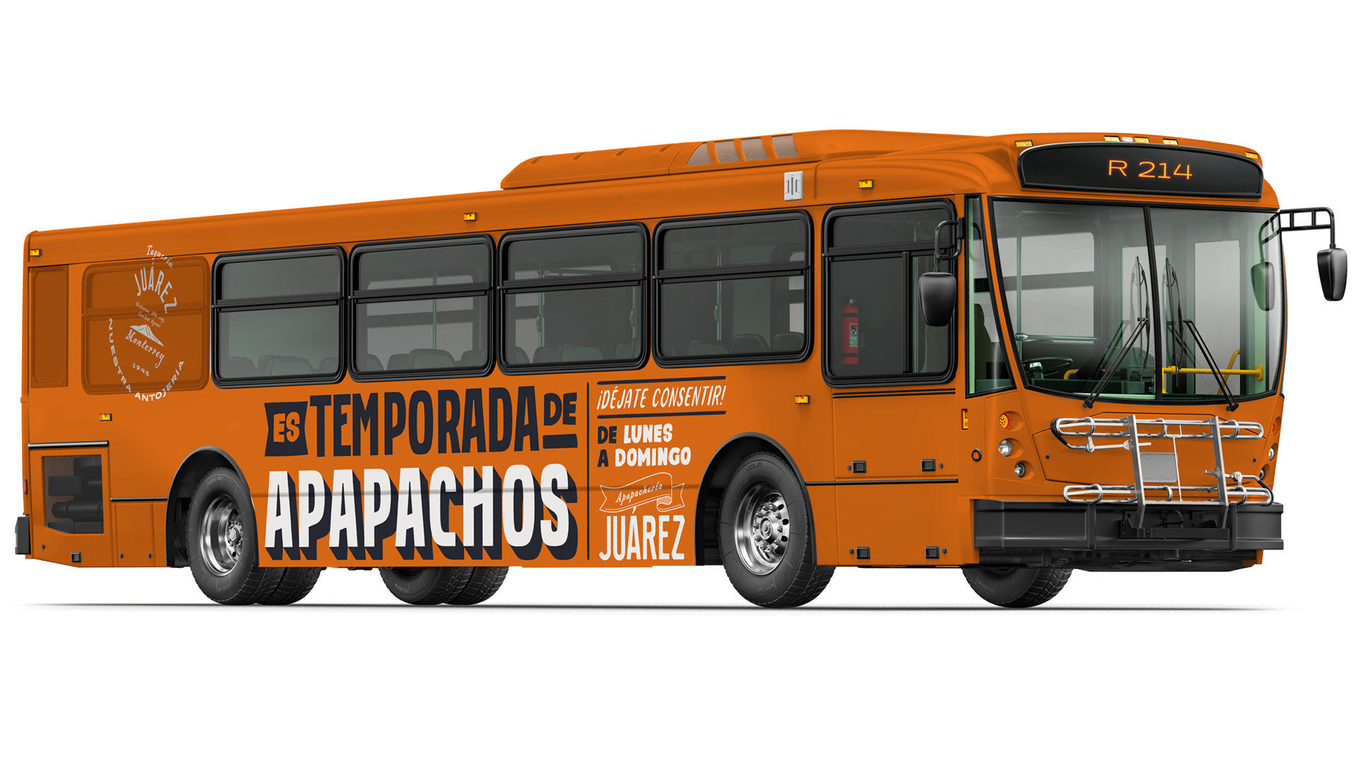
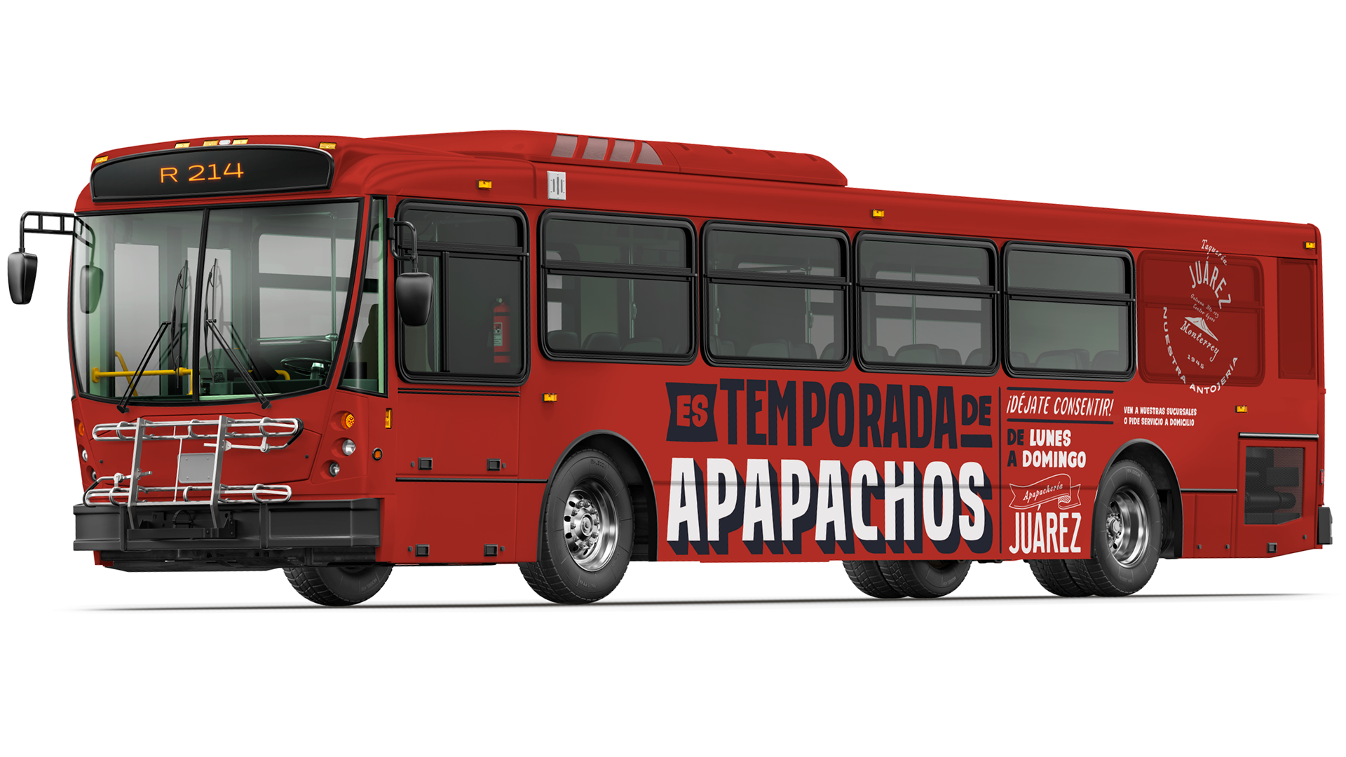
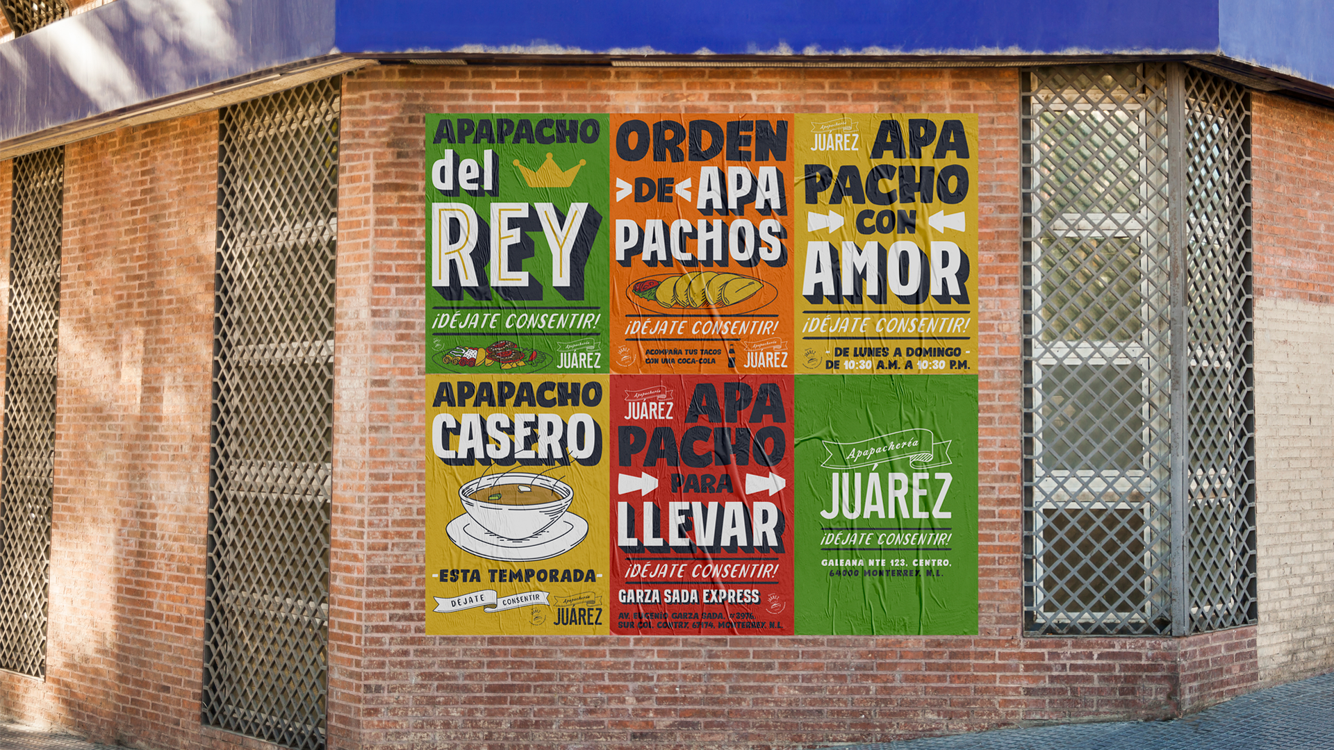
We designed this campaign using popular poster language with 3 typefaces that captured the hand-painted feel. Conceptualizing and executing each piece with a traditional mexican feel of painted signs and street lettering playing with the campaign’s main idea.
This new approach stated a fresh and friendly message for the winter season with powerful visuals, by sending a memorable message to the people while welcoming all for a delicious “apapacho” on every Taquería Juarez’s location in the city.
—
* Algunas de las fotografías solo aparecen de posición y no tienen un uso comercial. Some photographs appear for demonstration and they are not used for commercial purposes.